The graphic designer’s guide to Bauhaus design

From revolutionizing our understanding of typography to changing the way we approach editorial design, and design education in general—It’s hard to over-emphasize the importance of the Bauhaus school.
The Bauhaus was more than a design school. It was a movement and one that set out to bring craftspeople of all disciplines together. The movement so radically altered how we view design that, today, it’s a style and philosophy all of its own. It’s also an endless fount of inspiration for anyone working creatively.

Alberto Sartoris, Cathedral Notre-Dame du Phare, Fribourg, Switzerland, 1931. Image source: David Hannaford Mitchell on Tumblr
‘So let us therefore create a new guild of craftsmen, free of the divisive class pretensions that endeavored to raise a prideful barrier between craftsmen and artists! Let us strive for, conceive and create the new building of the future that will unite every discipline, architecture and sculpture and painting, and which will one day rise heavenwards from the million hands of craftsmen as a clear symbol of a new belief to come.’—Walter Gropius, architect and founder of the Staatliches Bauhaus, in the Bauhaus Manifesto
The history of the Bauhaus school provides insight into what the Bauhaus style came to stand for. It shook the world of architecture, furniture, and industrial design. But one of its most fascinating legacies lies in graphic design—something the Linearity team can’t get enough of.
Want to understand the story of Bauhaus and how you can incorporate it into your graphic design projects? Let’s take a look back.
Jumpstart your ideas with Linearity Curve
Take your designs to the next level.
Typography at the Bauhaus

Herbert Bayer’s cover of a book to accompany the Weimar Exhibition of 1923. Image source: Tobias Adam
Typography was central to the Bauhaus ethos—a discipline that Herbert Bayer, one of its most influential proponents, would transform forever. Bayer and his contemporaries revolutionized how we perceive and use type, departing from the ornate black letter typefaces like Fraktur used at the time in Germany.
As a whole, Serif typefaces were deemed unnecessary, with the clean, geometric forms of Sans Serif typefaces more representative of the school’s principles of simplicity and clarity.

Fraktur typeface specimen. Image source: Wikimedia
The Bauhaus’ typographic story is largely not about inventing new typefaces. Universal Type, however, was one of Bayer’s great innovations. It set out with the ambition to create a universal typeface—one that could transcend language barriers and communicate with universal clarity.
It was a groundbreaking achievement that laid the foundation for modernist typography. Universal Type did away with any decorative elements—even uppercase letters, which Beyer considered an unnecessary complication.

Type specimen for Universal type. Image source: Researchgate
While Herbert Bayer's contributions to Bauhaus typography are undeniable, the period also witnessed the widespread adoption of other new fonts that were developing at the time.
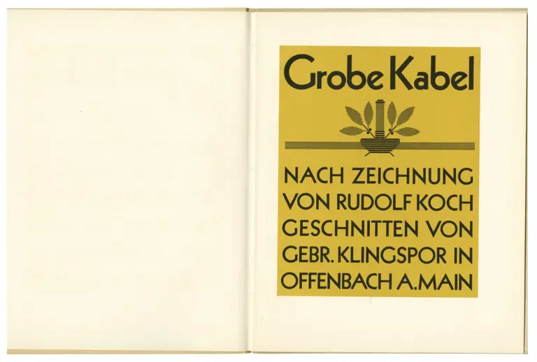
Type specimen for Kabel. Image source: Letterform archive

Type specimen for Gill Sans. Image source: History of Graphic Design
In addition to Futura and Kabel, Bauhaus designers experimented with other typefaces, such as Gill Sans, designed by Eric Gill in 1928.nnEach of these fonts brought unique characteristics to the typographic landscape and the way they were applied in Bauhaus graphic and poster design.
Bauhaus publication and poster design
The period saw a radical reimagining of publication and poster design, spearheaded by polymath designers such as Bayer and his contemporaries László Moholy-Nagy and Jan Tschichold.
Bayer's contributions to publication design were particularly influential. His work for the Bauhaus Journal (or Bauhaus Zeitschrift), which ran from the school’s opening in 1926 until 1931, exemplified minimalist layouts, geometric compositions, and experimental use of typography.
It transformed the magazine into a visual manifesto for the Bauhaus movement and showcased the school's programs, designs, and philosophical ideals.

Bauhaus magazine layout. Image source: Letterform archive
The entire catalog of Bauhaus journals is available for designers to download —a feast for anyone interested in graphic and typographic design history.
László Moholy-Nagy played a pivotal role in advancing Bauhaus poster design. His posters for Bauhaus exhibitions and events captured the spirit of the movement. Moholy-Nagy's historic experimentation with photomontage and overlay techniques pushed the boundaries of poster design and continues to influence art and advertising today.

Moholy-Nagy designed several posters and magazine covers for the avante-garde gallery Der Sturm. Image source: Guggenheim Museum
Jan Tschichold, another luminary of Bauhaus typography and graphic design, made significant contributions to publication design through his work on the "New Typography" movement.
In publications such as Die Neue Typographie (“The New Typography”), published in 1928, Tschichold advocated for a more rational and functional approach to typography. He laid the groundwork for modern editorial design.
Bayer, Moholy-Nagy, Tschichold, and their Bauhaus contemporaries revolutionized the way we think about publication and poster design, setting new standards for clarity, innovation, and visual communication that continue to resonate.


Bauhaus future: the influence of Bauhaus on contemporary typography design

Paula Scher, The Public Theater, 95-96 Season, 1995. Image source: MOMA
The legacy of Bauhaus typography reverberates through the work of contemporary designers, who draw inspiration from its principles to create bold, impactful typography for the digital age.
The work of Paula Scher, known for her bold typographic compositions, echoes the Bauhaus aesthetic.
Her poster designs for the Public Theater in New York City in the 90’s are exemplary. The influence of Bayer and Moholy-Nagy on Scher’s work is unmistakable.nnThe endurance of Bauhaus principles demonstrates how they can be applied to create dynamic and engaging typographic solutions that resonate with contemporary audiences.nnDesigner Jonathan Barnbrook pays homage to Bauhaus typography in his typefaces Bastard and Mason, demonstrating how Bauhaus-inspired typography can be structural but maintain charm.
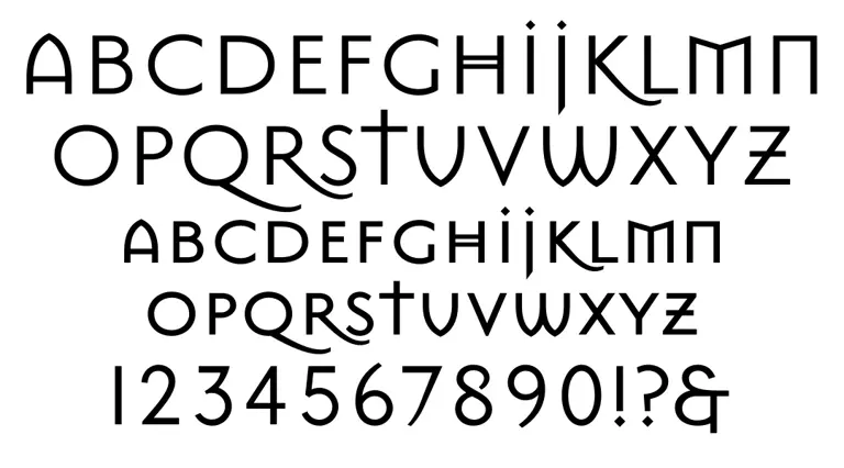
Mason Sans by Jonathan Barnbrook. Image source: Daylight
Foundries like Commercial Type and Hoefler&Co. are constantly creating contemporary typefaces that pay homage to Bauhaus principles while pushing the boundaries of innovation.
Fonts such as Graphik and Gotham, developed by Commercial Type, embrace the Bauhaus ethos of simplicity and universality, offering designers versatile tools for digital communication.
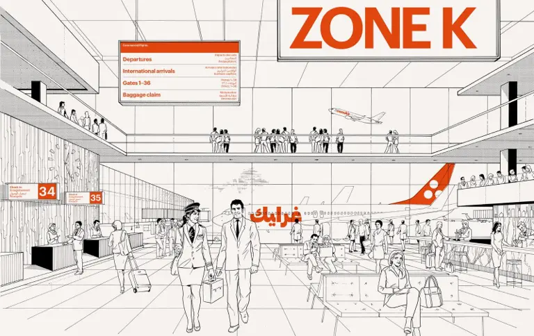
Graphik, designed by Commercial Type, used in context. Image source: Commercial Type


Graphic design inspiration from the Bauhaus movement
The original Bauhaus logo
Poster for the 1923 Bauhaus exhibition
The use of primary colors —red, yellow, and blue—along with black and white is typical of the Bauhaus emphasis on using color as a primary design element.
In terms of layout, Schmidt defies traditional conventions by breaking free from the constraints of a grid-based structure. Instead, he arranges the elements of the poster in a seemingly random fashion, with shapes and text intersecting and overlapping in unexpected ways.
Universal Type typeface
Herbert Bayer's Universal Type proposes a revolutionary approach to typography that continues to inspire designers today. Bayer's concept of Universal Type was not merely a new typeface but a comprehensive communication system —a radical departure from traditional typographic conventions that emphasized flexibility, functionality, and universality.
One of the key innovations of Bayer's Universal Type was its single-case design, which eliminated the distinction between uppercase and lowercase letters. This departure from the traditional dual-case system was groundbreaking in its simplicity and efficiency, allowing for greater legibility and clarity in written communication.
In addition to its single-case design, Bayer's Universal Type embraced geometric forms and clean lines that added visual interest and enhanced readability and coherence.

The Universal Type typeface by Herbert Bayer. Image source: Pixart Printing
An experiment with typophoto
László Moholy-Nagy's was a pioneer in exploring the potential of photography as a tool for graphic design—a practice he termed " typophoto."
Moholy-Nagy also experimented with other photographic techniques such as photograms and photomicrographs, pushing the boundaries of what was possible with the medium.
By blurring the lines between typography and photography, Moholy-Nagy challenged designers to rethink their approach to visual communication, encouraging them to embrace new technologies and techniques.
The Bauhaus curriculum
The visual design of the Bauhaus curriculum revolutionized art education. By starting with an understanding of form and having the opportunity to play with many materials and disciplines, students naturally gravitated toward the disciplines where their interests and talents were best suited.

Image Source: Crane Designs
Bauhaus exhibition poster
Collage by Grete Reinhardt

You need the Bauhaus, 1928, collage by Grete Reinhardt. Image source: Bauhaus Kooperation
Grete Reinhardt was a key figure in developing collage as a medium for artistic expression by juxtaposing disparate images, textures, and materials.
By breaking free from the constraints of traditional artistic mediums, Reinhardt explored the use of found objects and materials, such as newspapers, magazines, and photographs, to create her compositions.
Incorporating these everyday materials into her artwork, Reinhardt added layers of meaning and context. It transformed ordinary objects into works of art that spoke to the cultural and social realities of the time.
László Moholy-Nagy’sCity Lights (Die Lichter der Stadt)
László Moholy-Nagy's artwork "City Lights" (German: "Die Lichter der Stadt"), created in 1930, encapsulates his exploration of light, movement, and urban life.
How to apply Bauhaus style to your graphic design
We’ve just touched the surface of what Bauhaus can offer graphic designers looking to incorporate the principles of this groundbreaking movement into their work. Start by playing with geometry, color theory, minimalism, and functionality. Incorporate unique fonts into your work that creates a reference to your past, while steering your designs into the future.
Who knows, you might discover a whole new approach to your design work and creative process?
Explore the elements of Bauhaus design with Linearity Curve and Linearity Move —our design and animation software that brings ideas to life in a few clicks.
Linearity offers thousands of free design templates, vast image and vector stock libraries, and compatibility with other design software. Make your design workflow smoother than you ever imagined. There’s no better time to get started with Linearity.
Learn more about our lifetime annual discount for early adopters.

Frequently asked questions
Emphasizing experimentation and collaboration, the Bauhaus curriculum encouraged students to engage with new technologies and materials while fostering a dedication to the crafts and skills of the past. It was a revolutionary time for graphic design.
Typography, layouts, and the use of shape and color were being reimagined in a way that has significantly impacted graphic design well into the 21st century.
Bauhaus-style graphic design is grounded in the integration of form and function, emphasizing simplicity, geometric shapes, and a harmonious balance between aesthetics and usability.
The core principles include the use of primary colors, clean lines, and sans-serif typography to create clear, visually compelling designs.
The movement advocated for the unification of art, craft, and technology, suggesting that good design should be accessible to all and cater to the needs of society.
Bauhaus had a profound impact on modern typography by promoting the use of sans-serif fonts, which were seen as more legible and functional than their serif counterparts. The movement introduced minimalist typographic designs that focused on readability and simplicity.
Key figures such as Herbert Bayer and Josef Albers explored new typographic layouts and font designs, including the creation of universal typefaces that aimed to be clear and applicable across various media. This led to the widespread adoption of Bauhaus principles in digital design and branding.
Contemporary media is replete with examples of Bauhaus-inspired graphic design. Brands like Google, Apple, and Adobe frequently employ minimalist design elements reminiscent of the Bauhaus style, including clean lines, geometric shapes, and a restrained color palette.
Poster designs, website layouts, and even mobile app interfaces often reflect Bauhaus principles through their use of grid systems, sans-serif fonts, and a focus on user-friendly design.
Additionally, the resurgence of vintage and retro styles in advertising and social media has further popularized Bauhaus aesthetics in the digital age.


App of the Day
6.1K ratings
Get Started for free

Design in Curve.
Create sharp, scalable designs with intuitive tools for logos, illustrations, and professional branding.

Animate in Move.
Effortlessly create animations for social media, online ads, and motion graphics.
Trusted and used by leading brands


